Getting Started
System Requirements
Biblify UI is built with Flutter. Please follow the requirements based on your operating system.
- macOS: https://flutter.dev/docs/get-started/install/macos
- Windows: https://flutter.dev/docs/get-started/install/windows
- Linux: https://flutter.dev/docs/get-started/install/linux
Welcome to Biblify UI
Biblify UI is a modern, feature-rich e-book application built with Flutter and Riverpod. This documentation will guide you through the installation process, customization options, and troubleshooting tips.
Key Features
- Rich Reading Experience: Beautiful and customizable reader interface
- Audio Books: Listen to your favorite books with built-in audio player
- Multi-language Support: Available in multiple languages including English, Turkish, Spanish, French, and more
- Dark & Light Themes: Toggle between themes for comfortable reading
- Customizable: Change app name, icons, and branding easily
- Offline Access: Read your books without internet connection
Install the Test App
You can install the test version of Biblify UI on your iOS device using TestFlight. Simply scan the QR code below:

What's Next?
Now that you've installed Biblify UI, you can explore the following topics:
- Learn how to customize the app for mobile installation
- Understand the source code structure
- Configure themes and language settings
- Customize app name, app icons and splash screen
- Get answers to frequently asked questions
Mobile Installation
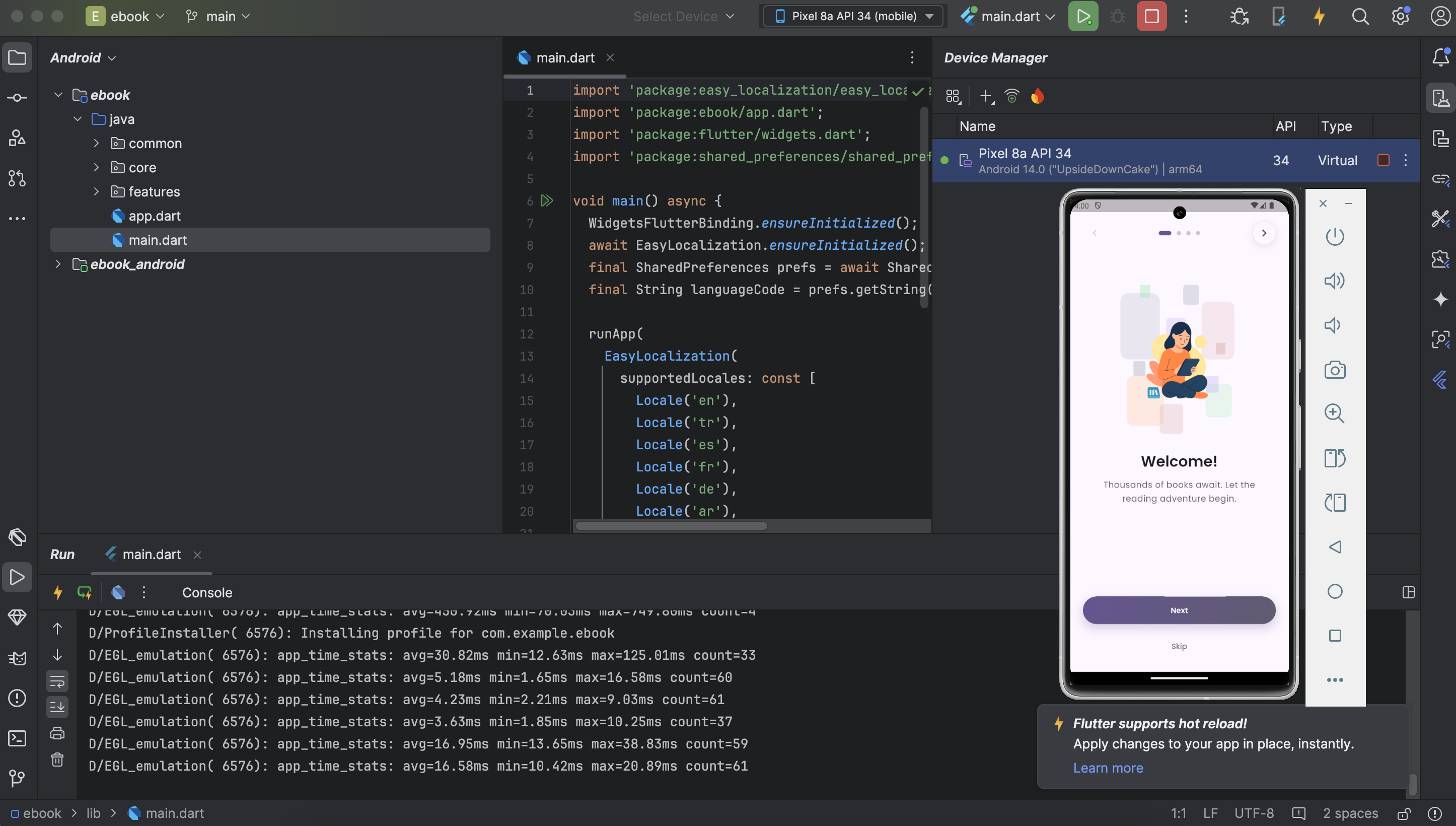
Run with Android
Step 1: Prerequisites
Android Studio: Please use Android Studio (4.0.1 or latest version)
Android Emulator: Make sure you already set up the Android emulator. See: https://flutter.dev/docs/get-started/install/macos#set-up-the-android-emulator
Step 2: Open Project
Open Android Studio and select Open an existing Android Studio project, then select
the e_book_riverpod-main folder that you extracted from the e_book_riverpod-main.zip
file.
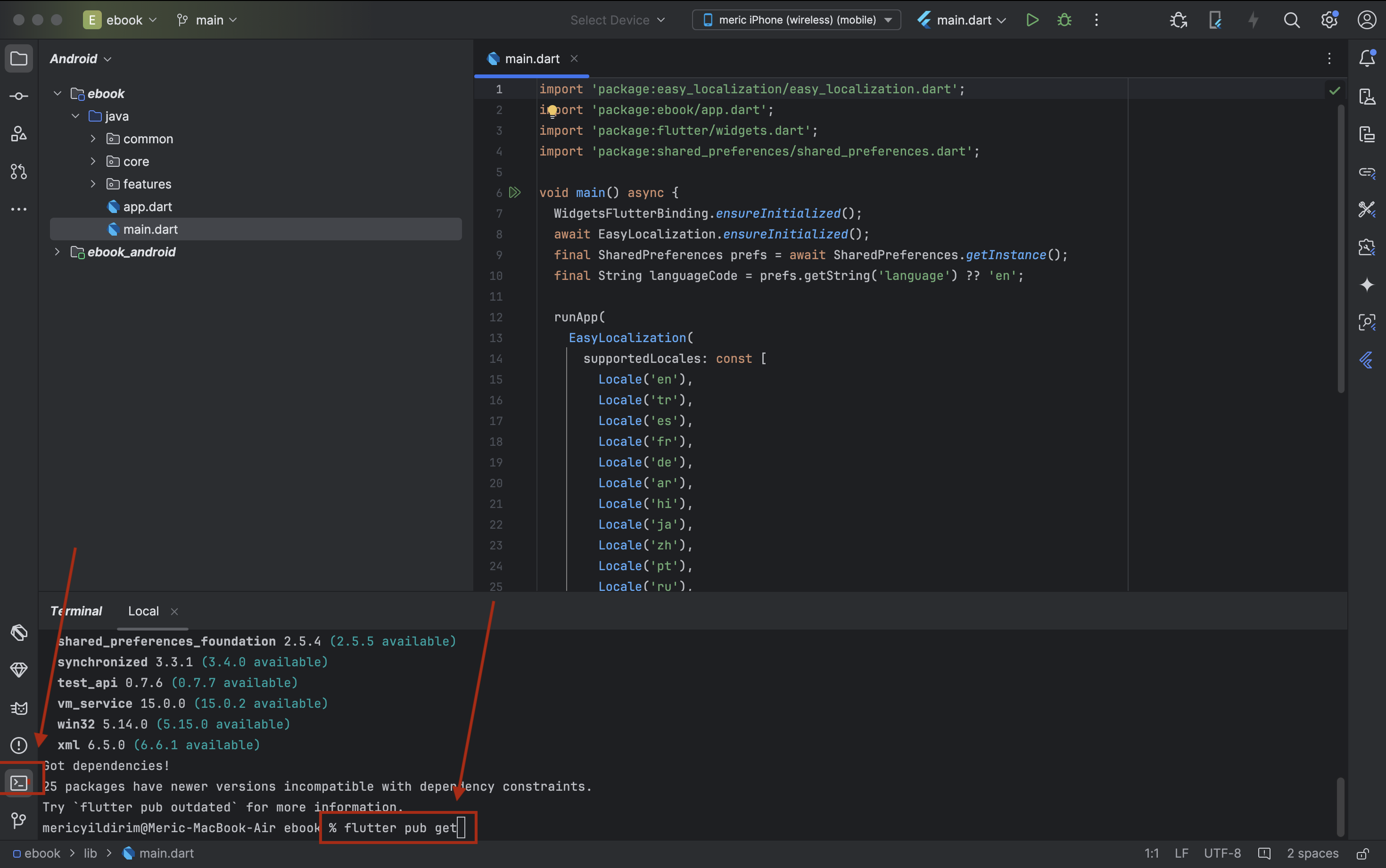
Step 3: Install Dependencies
Open the terminal console (usually located at the bottom of Android Studio) and run the following command to install all required dependencies:
flutter pub getThis command will download and install all the packages listed in the pubspec.yaml file.
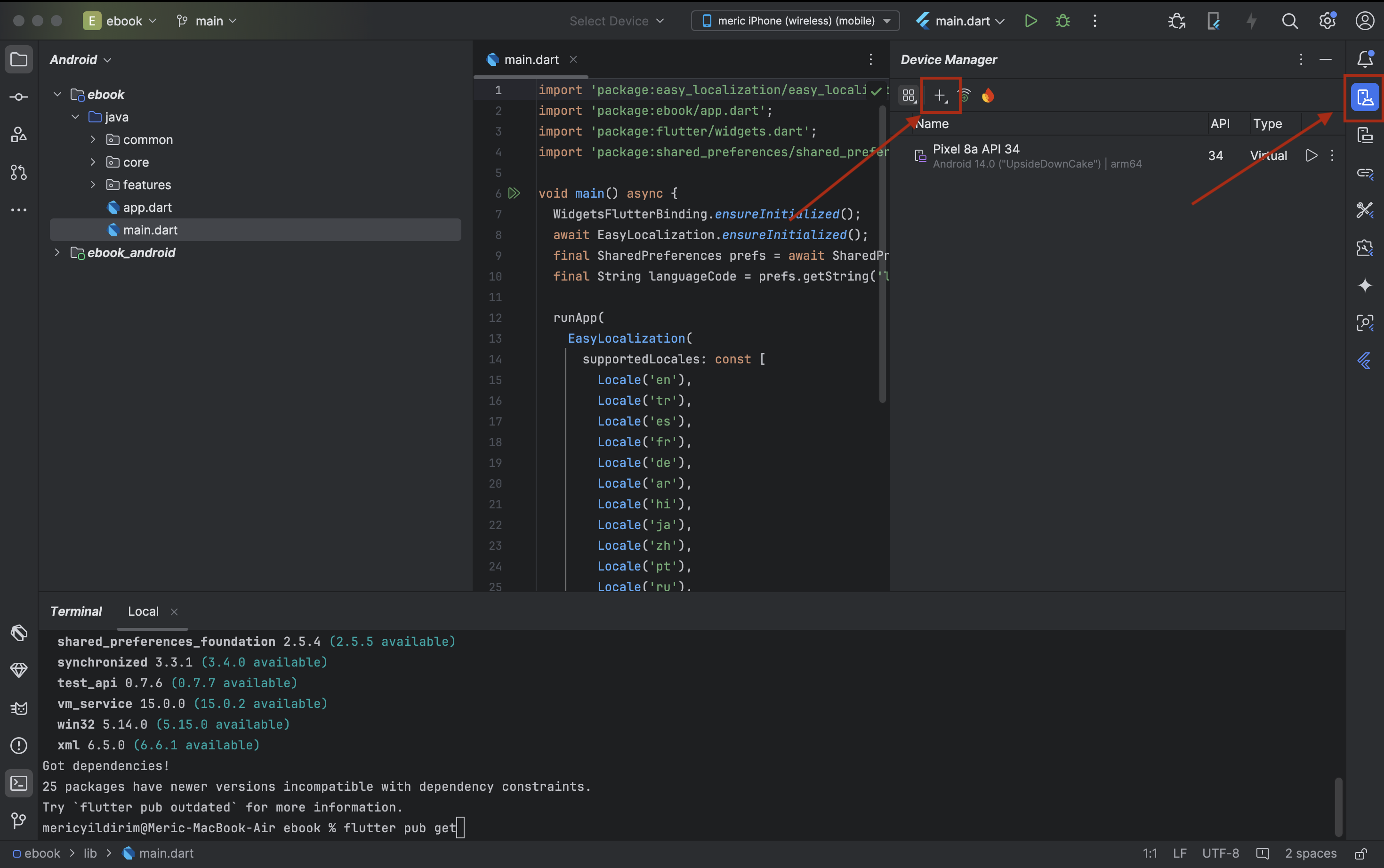
Step 4: Create Android Device
In the Device Manager (located in Android Studio's toolbar), create a new Android Virtual Device (AVD) if you haven't already. Select or create a device with appropriate specifications for testing the app.
Step 5: Select Device and Run
Select your Android device from the device dropdown (top toolbar), then click the Run button (green play icon) to build and run the application.
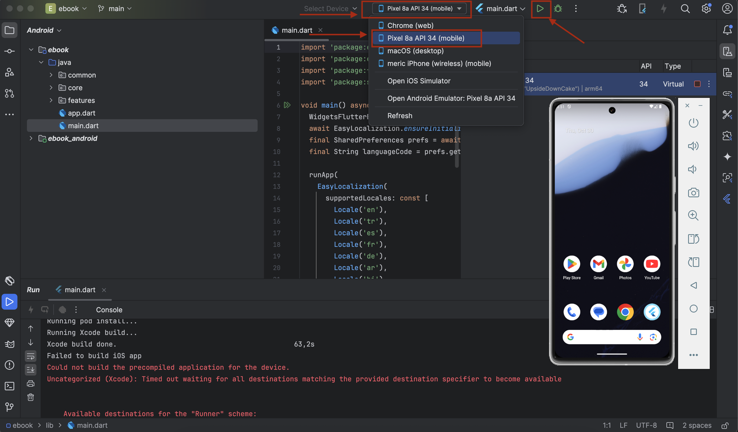
Step 6: Final Result
After a successful build, the app will launch on your selected Android device or emulator.
Run with iOS
Step 1: Prerequisites
Before you run the Biblify UI project, please make sure you have followed the guideline for iOS. See: https://flutter.dev/docs/get-started/install/macos
Step 2: Navigate to Project Folder
Open your terminal and navigate to the e_book_riverpod-main folder (main source code)
that you
extracted from the zip file.
cd e_book_riverpod-mainStep 3: Run Commands
Execute the following commands in sequence:
1. Open iOS Simulator:
open -a Simulator2. Clean the project:
flutter clean3. Check Flutter installation:
flutter doctor -v4. Upgrade Flutter (optional):
flutter upgrade5. Install dependencies:
flutter pub get6. Run the app:
flutter run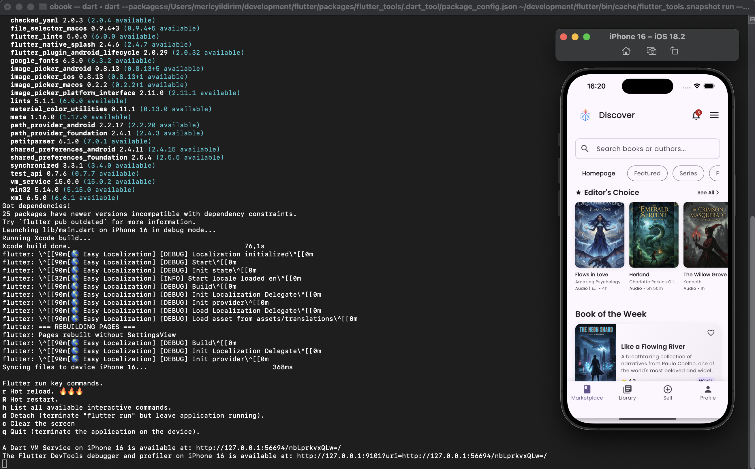
flutter run directly. Flutter's hot reload will allow
you to see changes instantly without rebuilding the entire app.
Source Structure
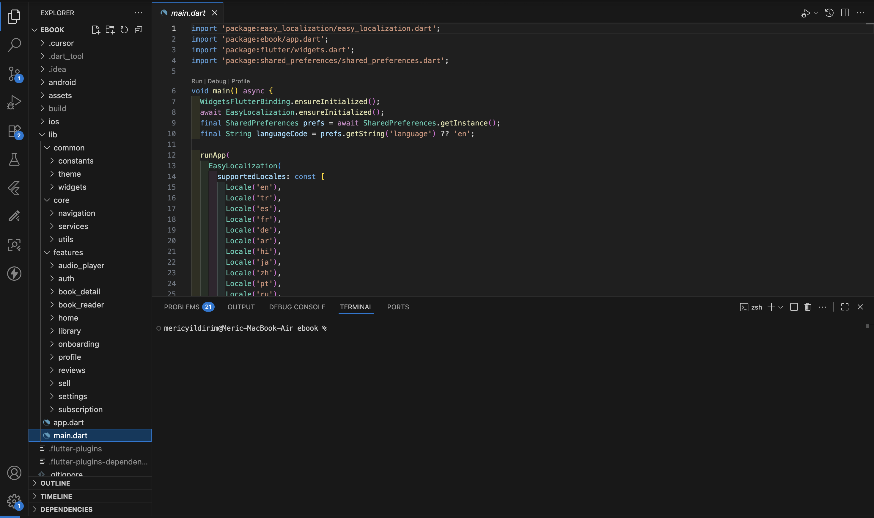
Project Architecture
Biblify UI follows a clean architecture pattern with feature-based organization. The project is structured to promote separation of concerns, reusability, and maintainability.
Core Layers
1. Entry Point (`main.dart` & `app.dart`)
The application starts in main.dart which:
- Initializes Flutter and EasyLocalization
- Sets up Riverpod's ProviderScope for state management
- Configures supported locales from translations
- Launches the App widget
app.dart is the main application widget that:
- Manages authentication and onboarding flow
- Handles theme switching (light/dark mode)
- Controls navigation between main app screens
- Persists user preferences via StorageService
- Implements AppThemeProvider for global theme state
2. Common Layer (`lib/common/`)
Shared resources used across the entire application:
- `constants/` - App-wide constants including:
app_constants.dart- Global configurationmenu_constants.dart- Navigation menu definitionsnavigation_constants.dart- Route definitions
- `theme/` - Theme configuration:
- Light and dark theme definitions
- Color schemes and styling
- `widgets/` - Reusable widgets:
- Bottom navigation bar
- Side menu overlay
- Settings modal helper
- Notifications system
3. Core Layer (`lib/core/`)
Fundamental services and utilities:
- `di/` - Dependency Injection:
providers.dart- Riverpod providers setup
- `navigation/` - Navigation management:
navigation_controller.dart- Singleton controller for navigation state
- `services/` - Core services:
storage_service.dart- Local storage (SharedPreferences) for settings, theme, auth statesubscription_service.dart- Subscription management
- `utils/` - Utility functions:
logger.dart- Centralized logging
4. Features Layer (`lib/features/`)
Self-contained feature modules following MVVM pattern. Each feature includes:
- `viewmodels/` - Business logic and state management
- `views/` - UI screens
- `widgets/` - Feature-specific widgets
- `models/` - Data models (where applicable)
- audio_player - Audio book player with speed, volume controls
- auth - Login, signup, password reset
- book_detail - Book information and actions
- book_reader - E-book reading interface with progress tracking
- home - Main dashboard with categories and search
- library - User's personal book library
- onboarding - First-time user introduction
- profile - User profile and statistics
- reviews - Book review system
- sell - Book selling interface
- settings - App settings and preferences
- subscription - Subscription plans and management
State Management
The app uses Riverpod for state management, providing:
- Type-safe, compile-time guarantees
- Automatic dependency injection
- Efficient rebuilds and performance optimization
- Easy testing and mocking
Localization
Multi-language support via EasyLocalization:
- Translations stored in
assets/translations/ - Supported languages include English, Turkish, Spanish, French, German, Arabic, Hindi, Japanese, Chinese, Portuguese, and Russian
- Automatic locale detection from device settings
Storage
Local persistence handled by StorageService using SharedPreferences:
- Theme preferences (light/dark)
- Authentication state
- Onboarding completion
- User preferences and settings
Navigation Pattern
The app uses a hybrid navigation approach:
- Bottom Navigation - Main app screens (Home, Library, Sell, Profile)
- PageView - Smooth transitions between main screens
- NavigationController - Centralized navigation state management
- Side Menu - Quick access to features and settings
Theme
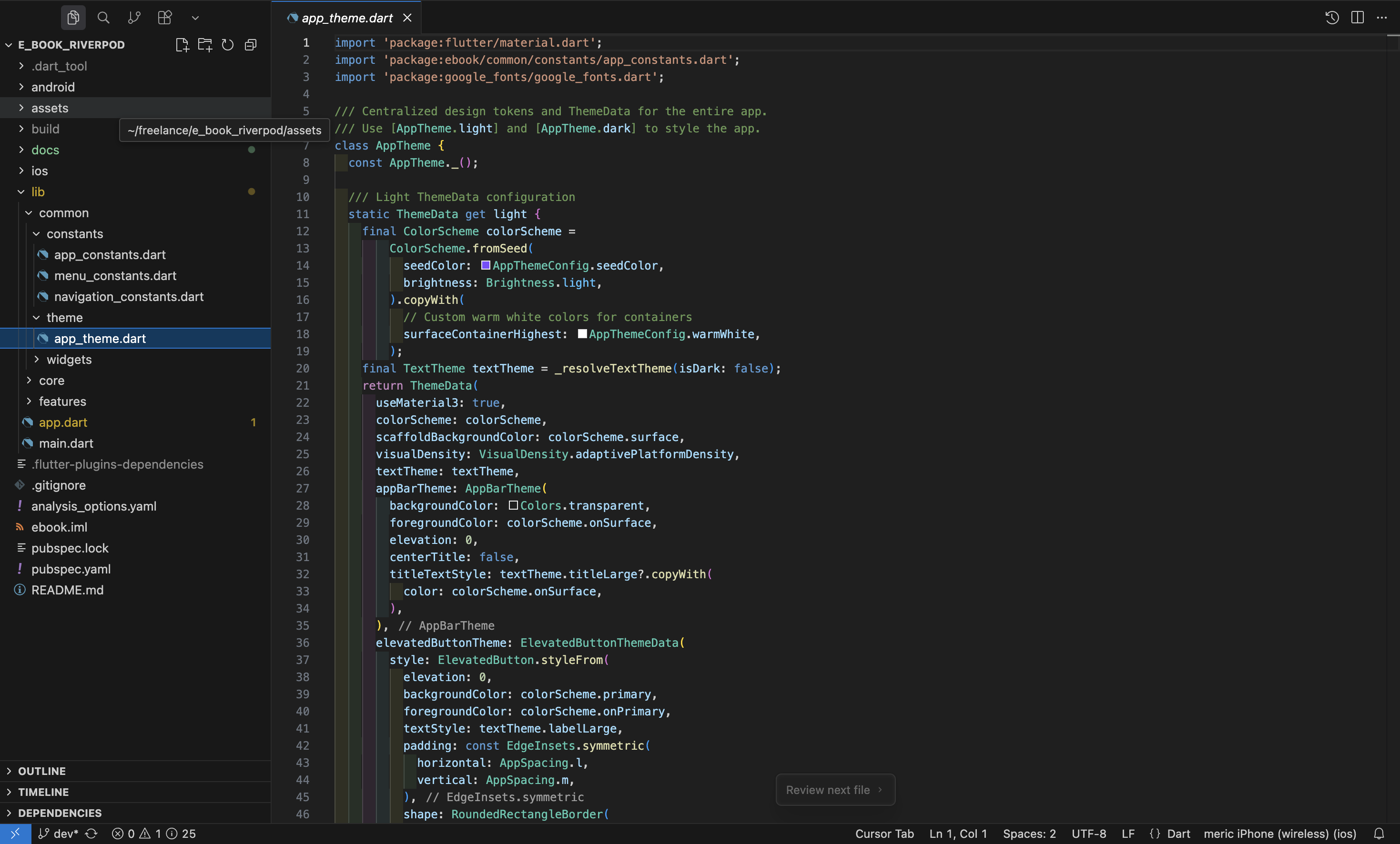
Customizing Theme Configuration
Biblify UI uses a centralized theme configuration system. You can easily customize colors, fonts, and
theme modes by modifying the constants in lib/common/constants/app_constants.dart.
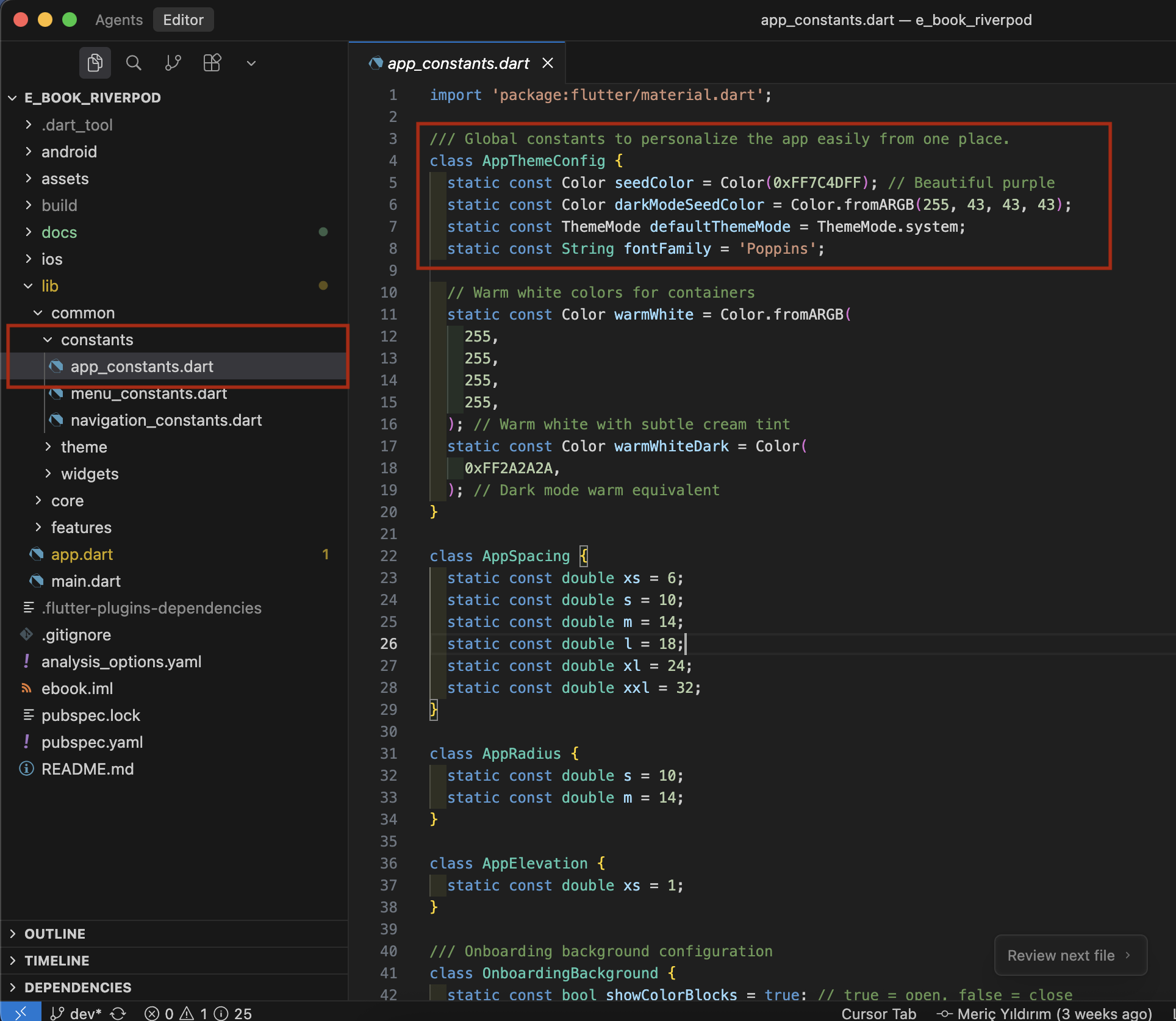
Basic Theme Settings in app_constants.dart
1. Seed Color (Light Mode)
The primary color used to generate the light theme color scheme:
static const Color seedColor = Color(0xFF7C4DFF); // Beautiful purpleColorScheme.fromSeed() to generate a
harmonious color palette for light mode.
2. Dark Mode Seed Color
The primary color used to generate the dark theme color scheme:
static const Color darkModeSeedColor = Color.fromARGB(255, 43, 43, 43);3. Default Theme Mode
Sets the default theme mode for the application:
static const ThemeMode defaultThemeMode = ThemeMode.system;Available options:
ThemeMode.light- Always use light themeThemeMode.dark- Always use dark themeThemeMode.system- Follow device settings (recommended)
4. Font Family
The primary font family used throughout the app:
static const String fontFamily = 'Poppins';Advanced Theme Configuration
For more detailed theme customization, you can modify the
lib/common/theme/app_theme.dart file. This file controls all aspects of the app's
visual appearance.
What app_theme.dart Controls
1. Color Schemes
The theme defines separate color schemes for light and dark modes:
- Primary and secondary colors
- Surface and background colors
- Error and success colors
- On-surface colors (text and icons)
2. Component Theming
Individual component themes can be customized:
- Buttons: Elevated, Text, Outlined button styles
- Input Fields: Text field decoration and border styles
- Cards: Elevation, margins, and border radius
- App Bar: Background, foreground, and elevation
- Bottom Navigation: Colors and display type
- Snackbars: Background, text style, and shape
- Chips: Label style and padding
- Dividers: Color and thickness
- Icons: Color theming
3. Typography
The theme uses Google Fonts to define text styles:
- Display styles (large/small)
- Headline styles (large/medium/small)
- Title styles (large/medium/small)
- Body styles (large/medium/small)
- Label styles (large/medium/small)
4. Spacing and Layout
The theme also defines consistent spacing values from app_constants.dart:
- AppSpacing: xs, s, m, l, xl, xxl (6-32 pixels)
- AppRadius: s, m (10-14 pixels)
- AppElevation: xs (1 pixel)
How Theme Changes Are Applied
The app listens for theme changes every 2 seconds and automatically updates the UI. The theme
preference is persisted using the StorageService, so your theme choice is remembered
across app restarts.
Language
Multi-Language Support
Biblify UI supports multiple languages through the EasyLocalization package. Adding a new language is straightforward and requires two simple steps.
Adding a New Language
Step 1: Add Translation JSON File
Create a new JSON file in the assets/translations/ directory with the language code as
the filename.
Example: For Korean, create ko.json
en.json and translate all the string values.
Translation File Structure
All translation files follow this structure:
{
    "login": {
        "appbar_title": "Biblify UI",
        "title": "Welcome to Biblify UI",
        "email": "Email",
        "password": "Password",
        ...
    },
    "home": {
        "app_title": "Biblify",
        "homepage": "Homepage",
        ...
    },
    ...
}
Currently Supported Languages
The app currently includes translations for:
- en - English 🇬🇧
- tr - Turkish 🇹🇷
- es - Spanish 🇪🇸
- fr - French 🇫🇷
- de - German 🇩🇪
- ar - Arabic 🇸🇦
- hi - Hindi 🇮🇳
- ja - Japanese 🇯🇵
- zh - Chinese 🇨🇳
- pt - Portuguese 🇵🇹
- ru - Russian 🇷🇺
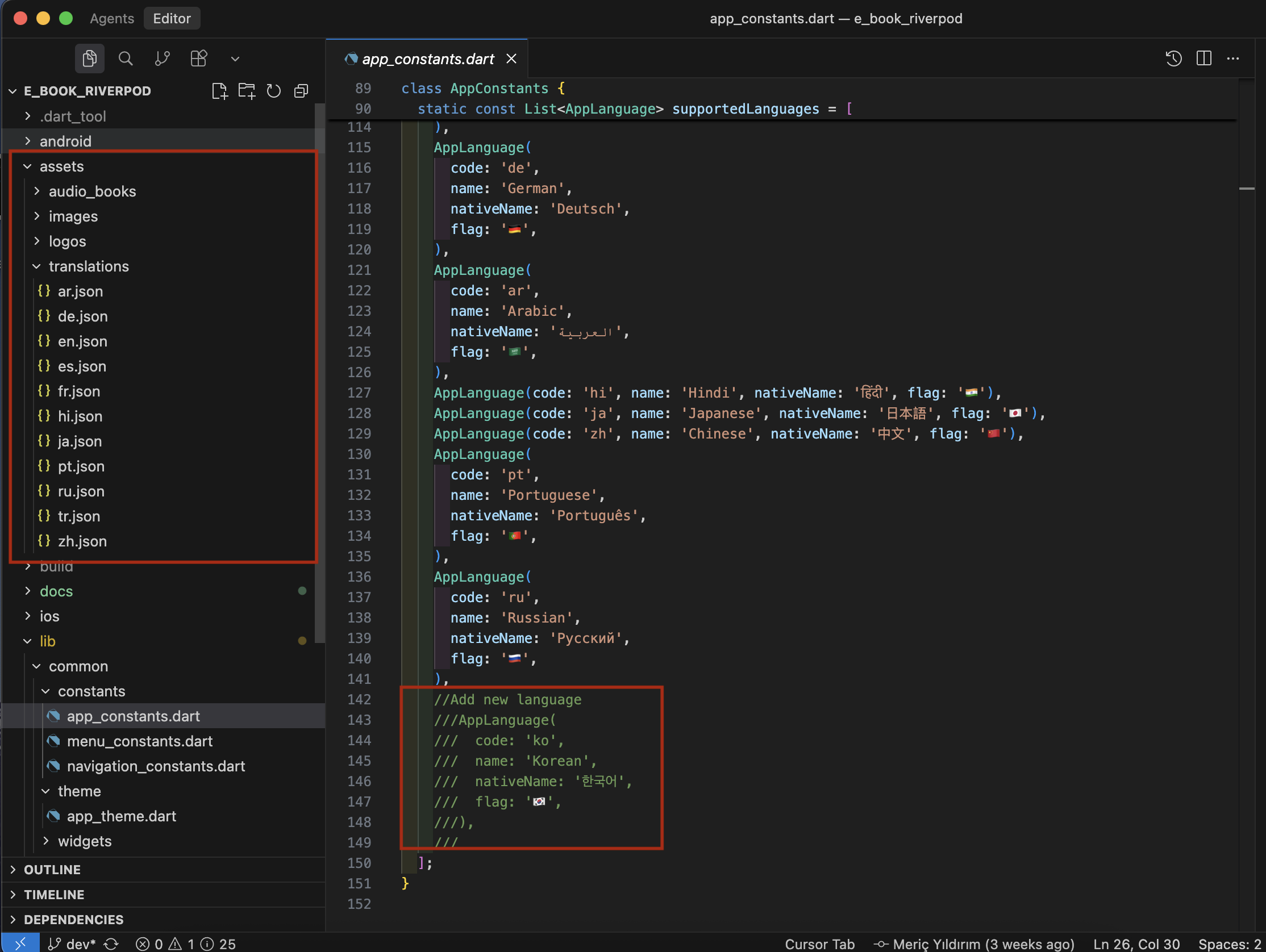
Step 2: Register Language in app_constants.dart
After creating the translation file, you need to register the language in the
AppLanguage class. Open lib/common/constants/app_constants.dart and add
your language to the supportedLanguages list.
AppLanguage(
  code: 'ko',           // Language code (ISO 639-1)
  name: 'Korean',       // Language name in English
  nativeName: '한국어',  // Language name in its native script
  flag: '🇰🇷',          // Country flag emoji
),
Breaking Down the Fields
- code: The ISO 639-1 two-letter language code (e.g., 'ko' for Korean, 'it' for Italian)
- name: The language name in English (e.g., 'Korean', 'Italian', 'Dutch')
- nativeName: The language name written in its native script (e.g., '한국어' for Korean, 'Italiano' for Italian)
- flag: The country flag emoji representing where the language is primarily spoken (e.g., 🇰🇷 for Korean)
Complete Example: Adding Korean
1. Create the translation file:
Create assets/translations/ko.json with all translated strings.
2. Add to supported languages list in app_constants.dart:
static const List<AppLanguage> supportedLanguages = [
  // ... existing languages ...

  //Add new language
  AppLanguage(
    code: 'ko',
    name: 'Korean',
    nativeName: '한국어',
    flag: '🇰🇷',
  ),
];//Add new language comment in the code already shows you exactly where to add new
languages. Simply uncomment and modify the existing example.
Language Selection
Users can change the app language from the Settings screen. The app remembers their preference using
EasyLocalization's built-in persistence.
Automatic Locale Detection
The app automatically detects the device's language preference on first launch. If the device language is supported, it will be used automatically. Otherwise, it falls back to English (en).
Translation Management
Best Practices
- Always keep en.json as reference: The English version should always be the most complete and up-to-date
- Maintain consistent structure: All language files should have identical JSON structure with only values translated
- Use proper formatting: Maintain proper indentation and follow JSON standards
- Test thoroughly: After adding a new language, test all screens to ensure no missing translations
- Include context: Consider adding comments in the code about specific translation requirements
Common Translation Keys
Some of the main translation categories include:
- login - Authentication screens
- reset_password - Password recovery
- home - Home dashboard
- library - User library
- profile - User profile
- settings - App settings
- subscription - Subscription management
- sell - Book selling
- audio_player - Audio book player
- book_reader - E-book reader
App Name
Customizing App Name
The app name is what users see on their device's home screen. You can customize it separately for Android and iOS.
Changing App Name on Android
Open android/app/src/main/AndroidManifest.xml and locate the android:label
attribute:
<application
    android:label="Biblify UI"
    android:name="${applicationName}"
    android:icon="@mipmap/ic_launcher">
Change "Biblify UI" to your desired app name. This will be displayed on Android devices.
Changing App Name on iOS
Open ios/Runner/Info.plist and locate the CFBundleDisplayName key:
<key>CFBundleDisplayName</key>
<string>Biblify UI</string>
Change the string value from Biblify UI to your desired app name. This will be displayed
on iOS devices.
CFBundleName key for consistency.
App Icons
Customizing App Icons
Biblify UI uses the flutter_launcher_icons package to generate app icons for both Android and iOS platforms.
Step 1: Prepare Your Icon Image
Create your app icon image with the following requirements:
- Format: PNG with transparency
- Recommended size: 1024x1024 pixels
- Background: Transparent (for best results)
- Design: Keep important content in the center (Android adaptive icons will crop edges)
Step 2: Place Icon in Assets
Save your icon image in the assets/logos/ directory (or create the directory if it
doesn't exist).
Example: If your icon is named my_app_logo.png, place it at:
assets/logos/my_app_logo.pngStep 3: Configure pubspec.yaml
Open pubspec.yaml and locate the flutter_launcher_icons: section. Update
the image paths:
flutter_launcher_icons:
  android: true
  ios: true

  # Genel logo (transparent)
  image_path: "assets/logos/my_app_logo.png"

  # Android konfigürasyonu
  adaptive_icon_background: "#FFFFFF"
  adaptive_icon_foreground: "assets/logos/my_app_logo.png"
  adaptive_icon_foreground_inset: 16

  # Android dark mode
  adaptive_icon_background_dark: "#10173a"
  adaptive_icon_foreground_dark: "assets/logos/my_app_logo.png"

  # iOS konfigürasyonu
  image_path_ios: "assets/logos/my_app_logo.png"
  image_path_ios_dark_transparent: "assets/logos/my_app_logo.png"
  remove_alpha_ios: true
  background_color_ios: "#FFFFFF"
Configuration Options Explained
- image_path: Main icon image for both platforms
- adaptive_icon_background: Android background color (light mode)
- adaptive_icon_foreground: Android foreground icon (light mode)
- adaptive_icon_background_dark: Android background color (dark mode)
- image_path_ios: Icon image for iOS (light mode)
- background_color_ios: iOS background color
Step 4: Generate Icons
Open your terminal and navigate to your project directory, then run:
flutter pub get
dart run flutter_launcher_icons
This command will generate icons in all required sizes for both Android and iOS.
flutter clean and rebuild your app to see
the new icons.
Splash Screen
Customizing Splash Screen
Biblify UI uses the flutter_native_splash package to generate splash screens for both platforms.
Step 1: Prepare Your Splash Screen Image
Your splash screen image should:
- Be a PNG file with transparency
- Be large enough (recommended: 1024x1024 pixels or larger)
- Have your logo/icon centered
- Work well on both light and dark backgrounds
Step 2: Place Image in Assets
Save your splash screen image in the assets/logos/ directory.
Step 3: Configure pubspec.yaml
Open pubspec.yaml and locate the flutter_native_splash: section. Update the
configuration:
flutter_native_splash:
  # Light tema: beyaz arka plan + siyah logo
  color: "#FFFFFF"
  image: "assets/logos/my_app_logo.png"

  # Dark tema: mor arka plan + beyaz logo
  color_dark: "#10173a"
  image_dark: "assets/logos/my_app_logo.png"

  # Android 12+ konfigürasyonu
  android_12:
    image: "assets/logos/my_app_logo.png"
    color: "#FFFFFF"
    icon_background_color: "#FFFFFF"

    image_dark: "assets/logos/my_app_logo.png"
    color_dark: "#10173a"
    icon_background_color_dark: "#10173a"
Configuration Options Explained
- color: Background color for light theme splash screen
- image: Image to display on light theme splash screen
- color_dark: Background color for dark theme splash screen
- image_dark: Image to display on dark theme splash screen
- android_12: Special configuration for Android 12+ devices
Step 4: Generate Splash Screen
Open your terminal and navigate to your project directory, then run:
flutter pub get
dart run flutter_native_splash:create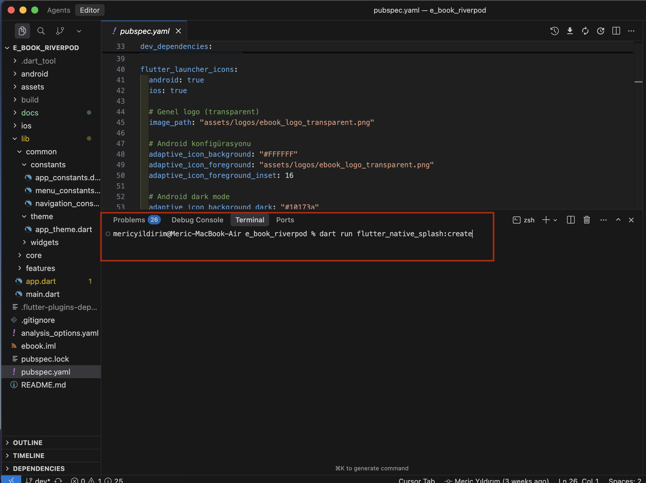
This command will generate splash screens for all required sizes and configurations.
image
and image_dark values.
Best Practices
- Consistency: Use the same logo for both icon and splash screen for brand consistency
- Testing: Always test splash screens on both Android and iOS devices
- Colors: Choose background colors that complement your logo and maintain readability
- Performance: Keep splash screen images optimized to ensure fast app launch
- Themes: Consider using different splash screens for light and dark themes
FAQ
Frequently Asked Questions
What is Biblify UI?
Biblify UI is a modern, feature-rich Flutter template for creating e-book and audiobook applications. It provides a complete UI implementation with beautiful design, multiple features, and extensive customization options.
Is this a complete app with backend?
No. Biblify UI is a backendless template that focuses entirely on the frontend/user interface. It provides:
- Complete UI/UX implementation
- Navigation and state management
- Mock data for demonstration
- Customization options for branding and theming
You will need to integrate your own backend API to make it fully functional with real data storage, authentication, and content management.
What features are included?
The template includes the following features:
- User authentication UI (login, signup, password reset)
- Onboarding flow
- Home page with categories and featured books
- Personal library management
- E-book reader with progress tracking
- Audio book player with controls
- Book detail pages
- Review and rating system
- Book selling interface
- User profile and statistics
- Settings and preferences
- Subscription management UI
What technologies are used?
- Flutter: Cross-platform app framework
- Riverpod: State management
- EasyLocalization: Multi-language support
- Google Fonts: Typography
- Material 3: Design system
- SharedPreferences: Local storage
- Audioplayers: Audio book playback
Can I customize the design?
Yes! The template is highly customizable:
- Change app colors and themes (light/dark mode)
- Modify typography and fonts
- Add or remove languages
- Customize app name, icons, and splash screen
- Adjust spacing, borders, and other design tokens
What platforms are supported?
Biblify UI supports both Android and iOS platforms. The codebase is shared between platforms, making it efficient to maintain and update.
Do I need coding experience?
Yes, basic knowledge of Flutter and Dart is recommended to customize and integrate backend services. However, the template is well-structured and documented, making it easier to understand and modify.
How do I add my own backend?
To integrate your backend:
- Replace mock data with API calls in viewmodels
- Implement authentication with your auth service
- Add REST API client (e.g., Dio, http package)
- Connect to your database for book content and user data
- Implement file upload for book covers and content
- Add payment integration for subscriptions
Is there a database included?
No, there is no database included. The template uses mock data and local storage (SharedPreferences) for demonstration purposes. You'll need to set up your own database (Firebase, Supabase, PostgreSQL, etc.) and integrate it with your backend API.
Can I sell books with this template?
The template includes a complete UI for selling books, but you'll need to implement:
- Payment gateway integration (Stripe, PayPal, etc.)
- Backend API for managing transactions
- Content delivery system for purchased books
- User purchase history and management
Is authentication implemented?
The template includes a complete authentication UI, but it uses mock authentication for demonstration. You'll need to integrate with your own authentication service (Firebase Auth, Supabase Auth, or a custom backend).
How do I add more languages?
Adding languages is straightforward:
- Create a JSON translation file in
assets/translations/ - Add the language to the
supportedLanguageslist inapp_constants.dart - The new language will appear in the settings
See the Language section for detailed instructions.
Can I change the app theme?
Absolutely! You can customize:
- Primary colors for light and dark modes
- Component styling (buttons, cards, inputs)
- Typography and fonts
- Spacing and layout
See the Theme section for detailed instructions.
What file structure should I follow?
The template follows a clean architecture pattern with:
- Feature-based organization
- MVVM pattern (Model-View-ViewModel)
- Separation of concerns
- Reusable components
See the Source Structure section for a detailed explanation.
How do I update dependencies?
To update Flutter packages:
flutter pub get
flutter pub upgrade
Make sure to test your app after updating to ensure compatibility.
Where can I get support?
For issues, questions, or contributions:
- Check this documentation thoroughly
- Review the code comments for guidance
- Refer to Flutter and package documentation
- Search for similar issues in Flutter community forums
Can I use this for commercial projects?
Please check the license agreement that came with this template. Typically, templates like this are intended for commercial use, but specific terms may vary. Make sure to comply with all third-party package licenses used in the template.
Troubleshooting
Quick Fixes
If you're experiencing any issues with the app, try these basic commands first:
flutter clean
flutter pub get
flutter run
These commands will:
flutter clean- Remove build artifacts and cacheflutter pub get- Download and install dependenciesflutter run- Run the app on your device/emulator
Widgets
Widget Overview
Biblify UI includes a comprehensive collection of reusable widgets organized into two main categories: Common Widgets and Feature-Specific Widgets. These widgets follow Material 3 design principles and are fully responsive.
Common Widgets
These widgets are used across multiple features and can be found in lib/common/widgets/:
AppBottomNavigationBar
Location: lib/common/widgets/app_bottom_navigation.dart
A bottom navigation bar used throughout the application for main navigation between Home, Library, Sell, and Profile screens.
- Features: Material 3 design, responsive sizing, customizable icons and labels
- Properties: currentIndex, onTap callback, tablet support
- Design: Includes home indicator, shadow effects, theme-aware borders
SideMenuOverlay
Location: lib/common/widgets/side_menu_overlay.dart
A sliding side menu overlay that provides quick access to app features and settings.
- Features: Animated slide-in, premium status indicator, customizable callbacks
- Properties: Navigation callbacks (profile, library, settings, etc.), premium badge
- Design: Responsive width, rounded corners, backdrop overlay, theme-aware styling
NotificationsOverlay
Location: lib/common/widgets/notifications_overlay.dart
A bottom sheet overlay for displaying notifications with a list view.
- Features: Notification list, empty state, clickable items
- Properties: List of notifications, onClose callback
- Design: Rounded top corners, responsive height, theme-aware cards
SettingsModalHelper
Location: lib/common/widgets/settings_modal_helper.dart
A helper class for consistently showing settings modals as bottom sheets.
- Features: Draggable sheet, handle bar, theme integration
- Properties: Responsive sizing, language change callback
- Design: Gesture-based closing, smooth animations
Home Feature Widgets
Located in lib/features/home/widgets/:
SearchBar
A search input field with icon and placeholder text.
- Responsive sizing, theme-aware styling
- Search functionality ready for integration
BookCard
Displays book information with cover image and details overlay.
- Variants: Full card and compact card modes
- Features: Book cover, title, author, rating display
- Design: Gradient overlays, responsive dimensions
FeaturedBookCard
A prominent card for showcasing featured books.
CategoriesGrid
Displays book categories in a grid layout.
CategoryFilter
Allows users to filter books by category.
DiscoverTabs
Tab-based navigation for different book discovery sections.
HorizontalBookList
Horizontal scrolling list of books.
Auth Feature Widgets
Located in lib/features/auth/widgets/:
SignInButton
Styled button for authentication actions.
SegmentedAuthSwitch
Switch between login and signup modes.
ResetPasswordWidget
Form for password reset functionality.
Profile Feature Widgets
Located in lib/features/profile/widgets/:
UserInfoCard
Displays user profile information and avatar.
StatisticsCard
Shows user reading statistics and achievements.
RecentBooksCard
Displays recently read or purchased books.
UserReviewsSection
Shows reviews written by the user.
Book Detail Feature Widgets
Located in lib/features/book_detail/widgets/:
BookInfoSection
Main book information display.
BookDetailsSection
Detailed metadata about the book.
AboutBookSection
Book description and synopsis.
ActionButtons
Primary action buttons (read, add to library, etc.).
SellerInfoSection
Information about the book seller.
Book Reader Feature Widgets
Located in lib/features/book_reader/widgets/:
ReaderHeader
Header with reading controls and back button.
PageContent
Main content area for displaying book pages.
ReadingProgress
Progress indicator showing reading position.
ReaderControls
Reading settings and customization options.
Audio Player Feature Widgets
Located in lib/features/audio_player/widgets/:
AudioControls
Main control buttons (play, pause, skip).
ProgressBar
Audio playback progress indicator.
SpeedControl
Playback speed adjustment.
VolumeControl
Volume adjustment controls.
Library Feature Widgets
Located in lib/features/library/widgets/:
LibraryBookCard
Book card specifically for library view.
LibraryCategoryFilter
Filter books in user's library.
LibrarySearchBar
Search functionality for library.
Sell Feature Widgets
Located in lib/features/sell/widgets/:
BookCoverCard
Upload and display book cover image.
BookDetailsCard
Form for entering book details.
ContentUploadCard
Upload book content files.
DescriptionCard
Book description input.
Reviews Feature Widgets
Located in lib/features/reviews/widgets/:
ReviewCard
Displays individual review.
ReviewForm
Form for submitting reviews.
ReviewSummary
Overall rating summary.
ReviewsSection
Complete reviews section with list.
Subscription Feature Widgets
Located in lib/features/subscription/widgets/:
SubscriptionPlanCard
Displays subscription plan details and pricing.
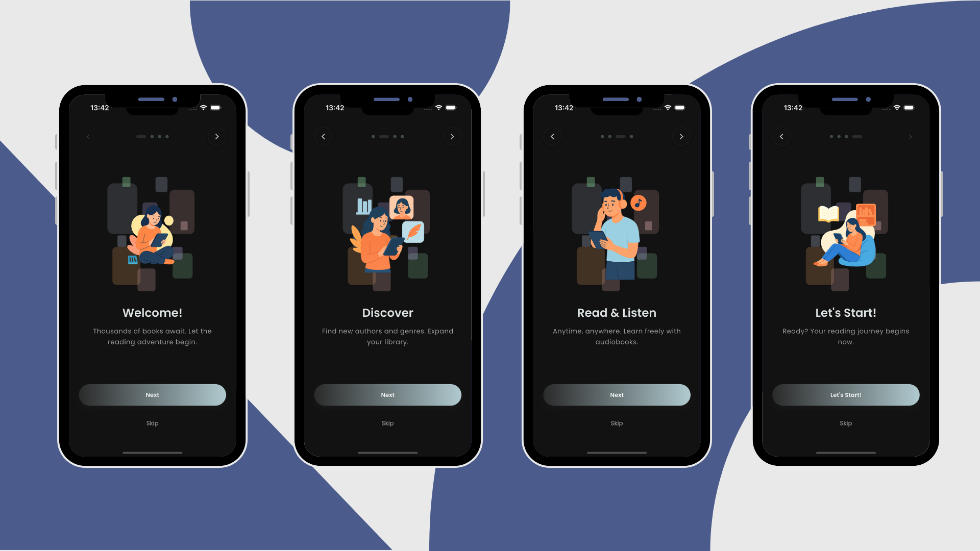
Onboarding Feature Widgets
Located in lib/features/onboarding/widgets/:
OnboardingButton
Styled button for onboarding actions.
OnboardingPageContent
Content display for onboarding pages.
PageIndicator
Visual indicator for onboarding page progress.
Widget Customization
Theme Integration
All widgets automatically integrate with the app's theme system:
- Adapt to light/dark mode
- Use Material 3 color schemes
- Follow spacing and typography tokens
- Support custom color overrides
Responsive Behavior
Widgets accept isTablet and isLargeScreen parameters to adjust:
- Font sizes
- Padding and margins
- Layout proportions
- Icon sizes
Localization
All text in widgets uses EasyLocalization for multi-language support. Simply add translations to the JSON files.
Using Widgets
Basic Usage
Import and use widgets in your views:
import 'package:ebook/common/widgets/app_bottom_navigation.dart';

// In your build method
AppBottomNavigationBar(
  currentIndex: _currentIndex,
  onTap: (index) {
    // Handle navigation
  },
)
With Callbacks
Pass callbacks for user interactions:
SideMenuOverlay(
  onClose: () => _closeMenu(),
  onProfileTap: () => _navigateToProfile(),
  onSettingsTap: () => _openSettings(),
)